JUAN DÍAZ-FAES
Dynamic skins
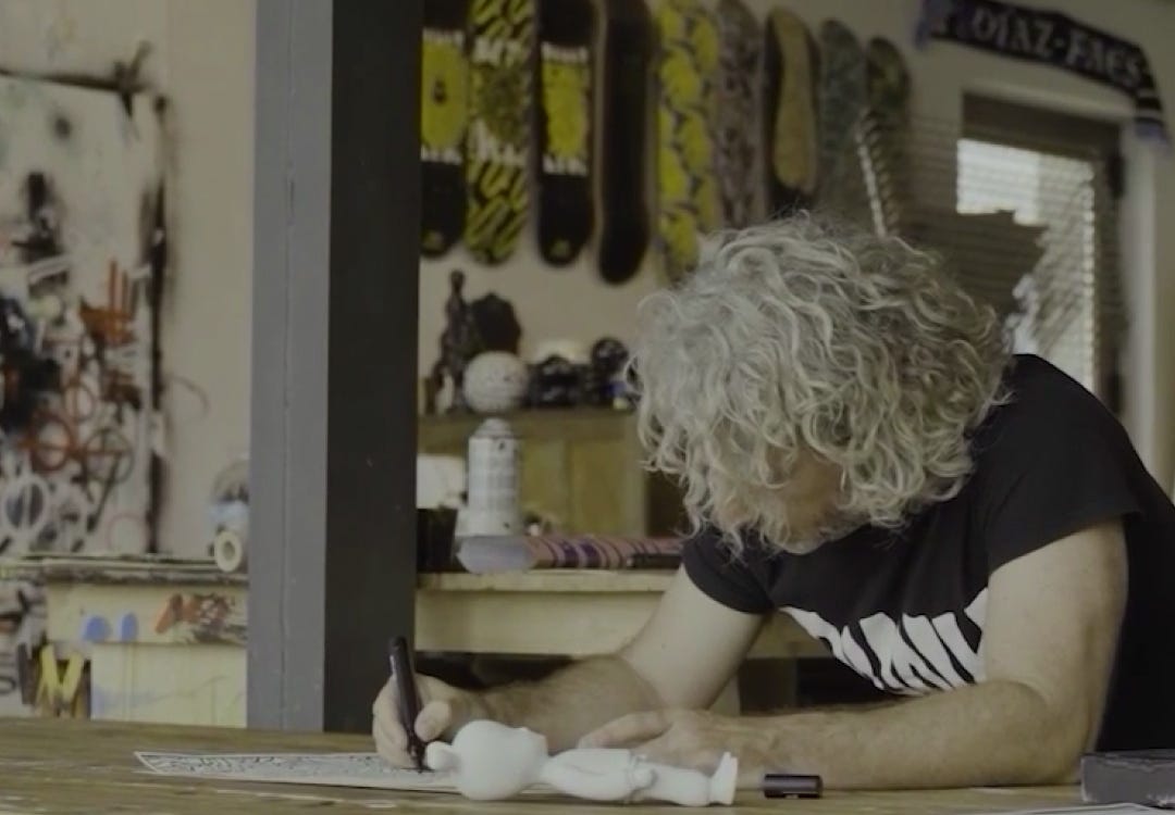
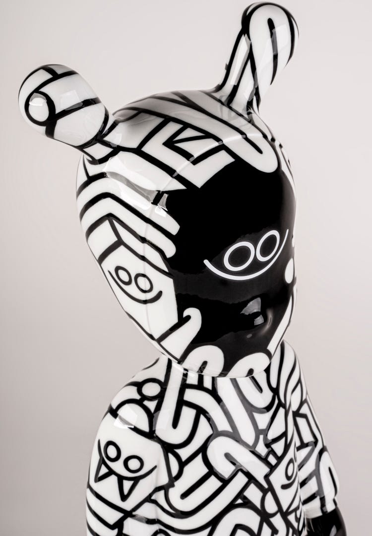
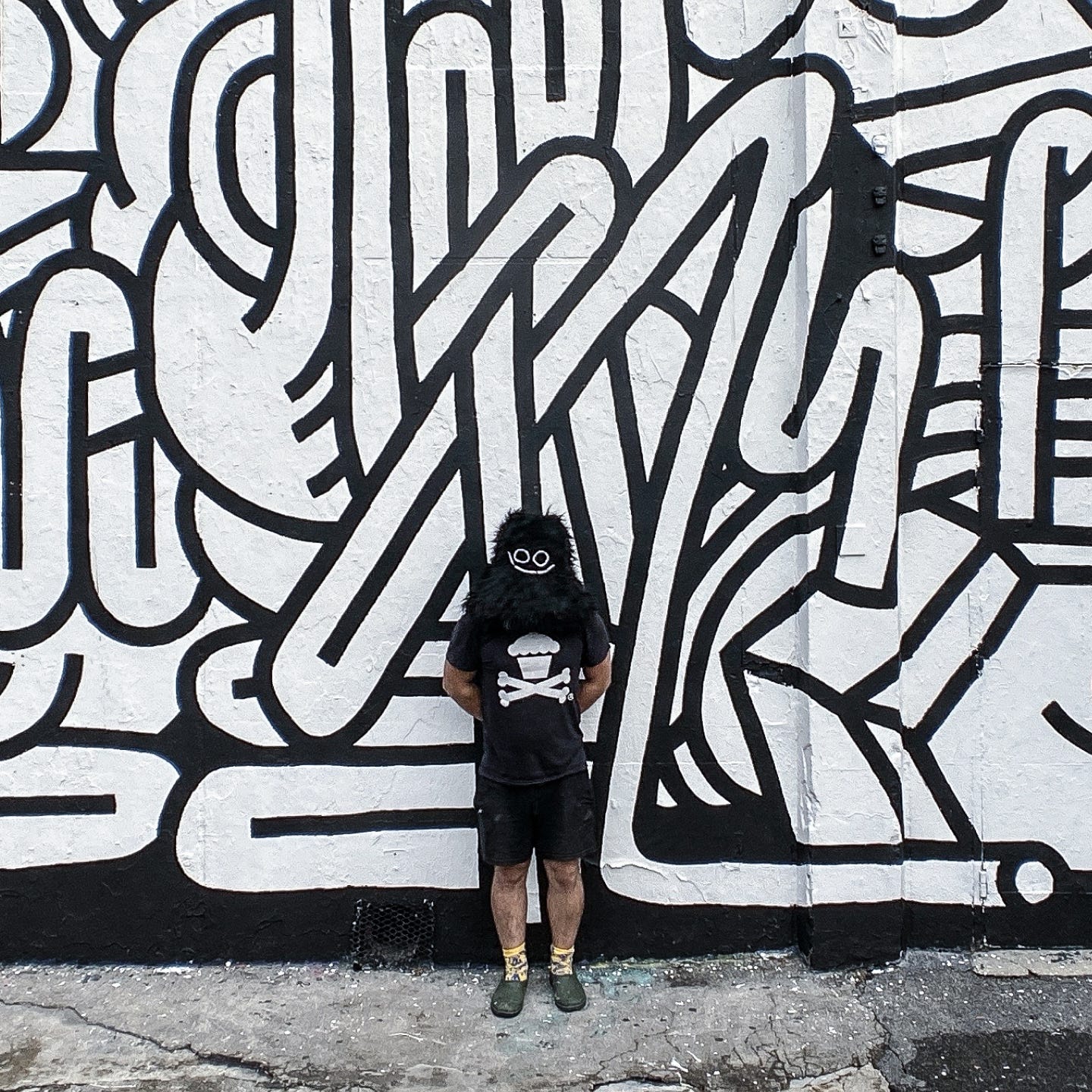
Born in Oviedo, in northern Spain, Juan Díaz-Faes is an artist, muralist, and illustrator with a playful and approachable visual language. His unmistakable style is defined by geometric forms and repetitive patterns in black and white.
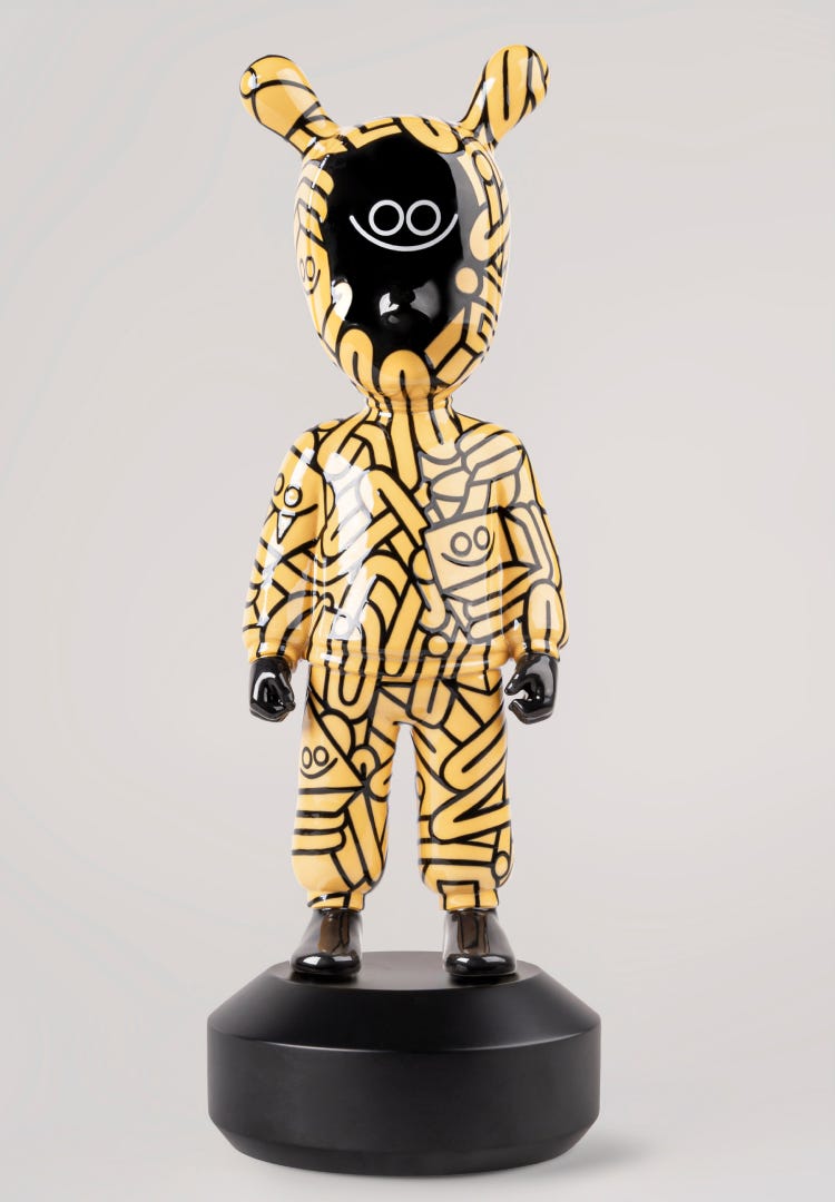
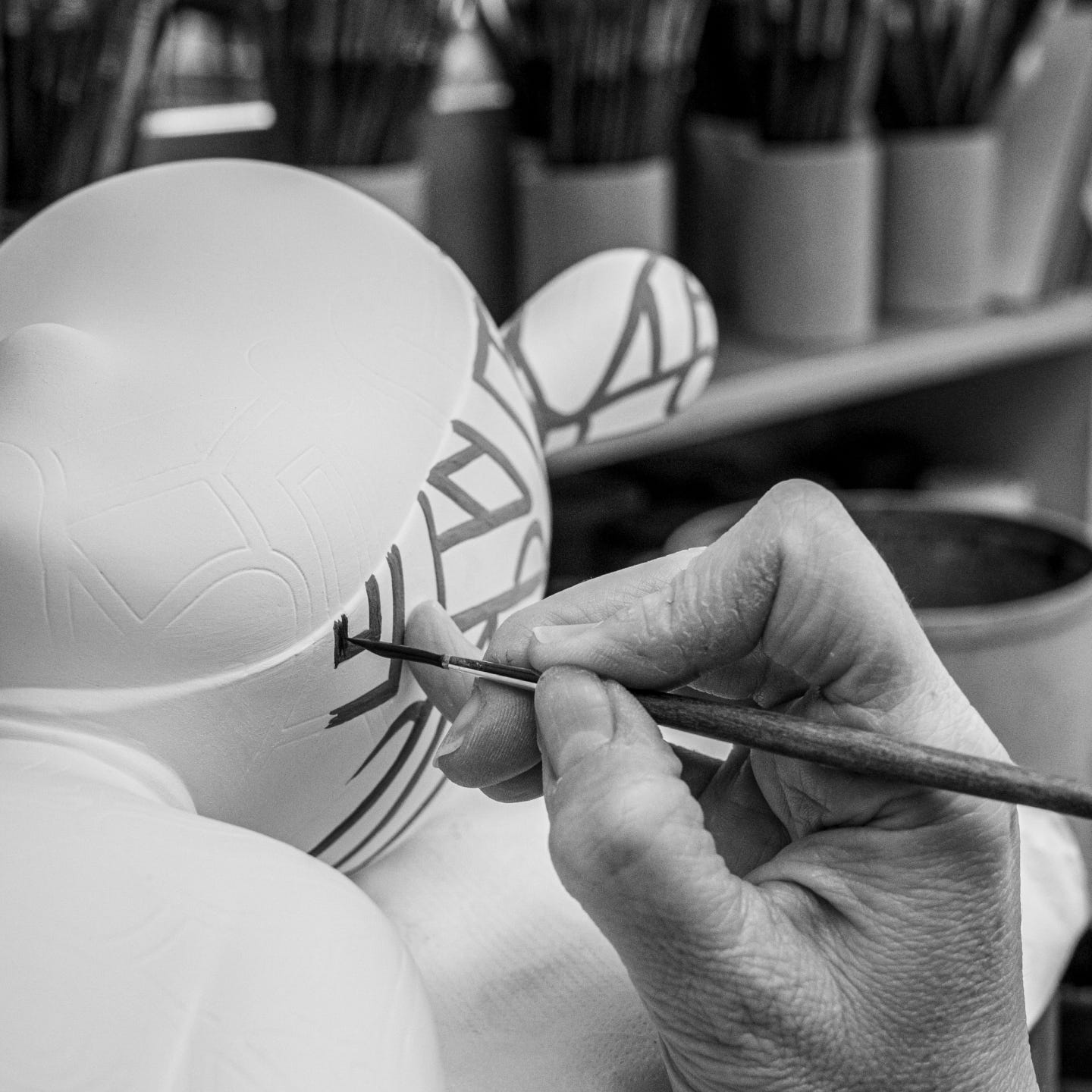
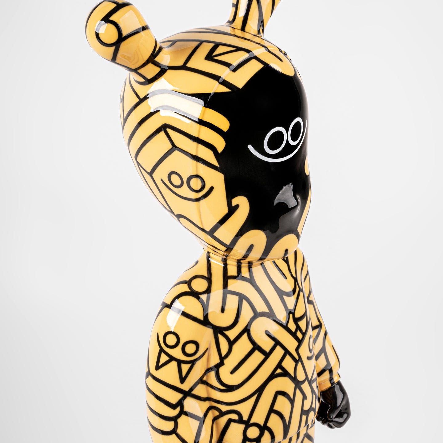
His version of The Guest turns the signature character into a three-dimensional surface, which he treats like a kind of “cloak”, blurring the lines between garment and skin, to apply his trademark patterns.


What was the first thing you thought when you were invited to take part in The Guest, a project that has seen the vision of so many diverse creators?
When the proposal came up, I immediately thought about the porcelain creations I grew up with at home. Lladró is an iconic brand in the world of porcelain, almost a fetish object—which I find very appealing. I thought that decades ago someone was asked to design the creations that went on to become generational icons. And I thought, haha, can you imagine that in 50 years these ones end up in people’s homes as well? That idea alone was especially attractive to me.
How did you approach translating your graphic language into a three-dimensional creation like this?
When the form is irregular and already well designed, as is the case with The Guest, I tend to use patterns because they adapt to any shape and surface. I created a kind of “cloak” for the character, suggesting something between clothing and skin. I also enjoy using this kind of graphics because they allow the viewer to discover the creation in layers, revealing new details over time.
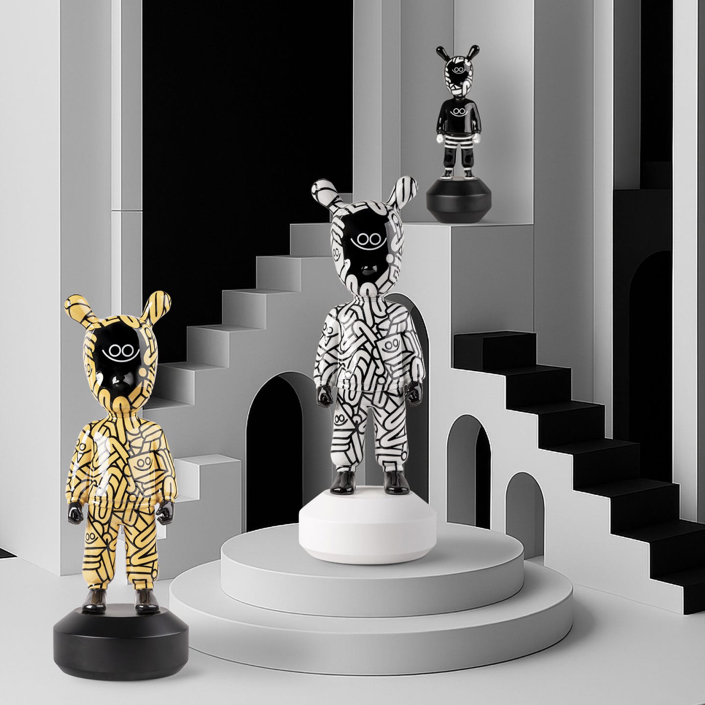
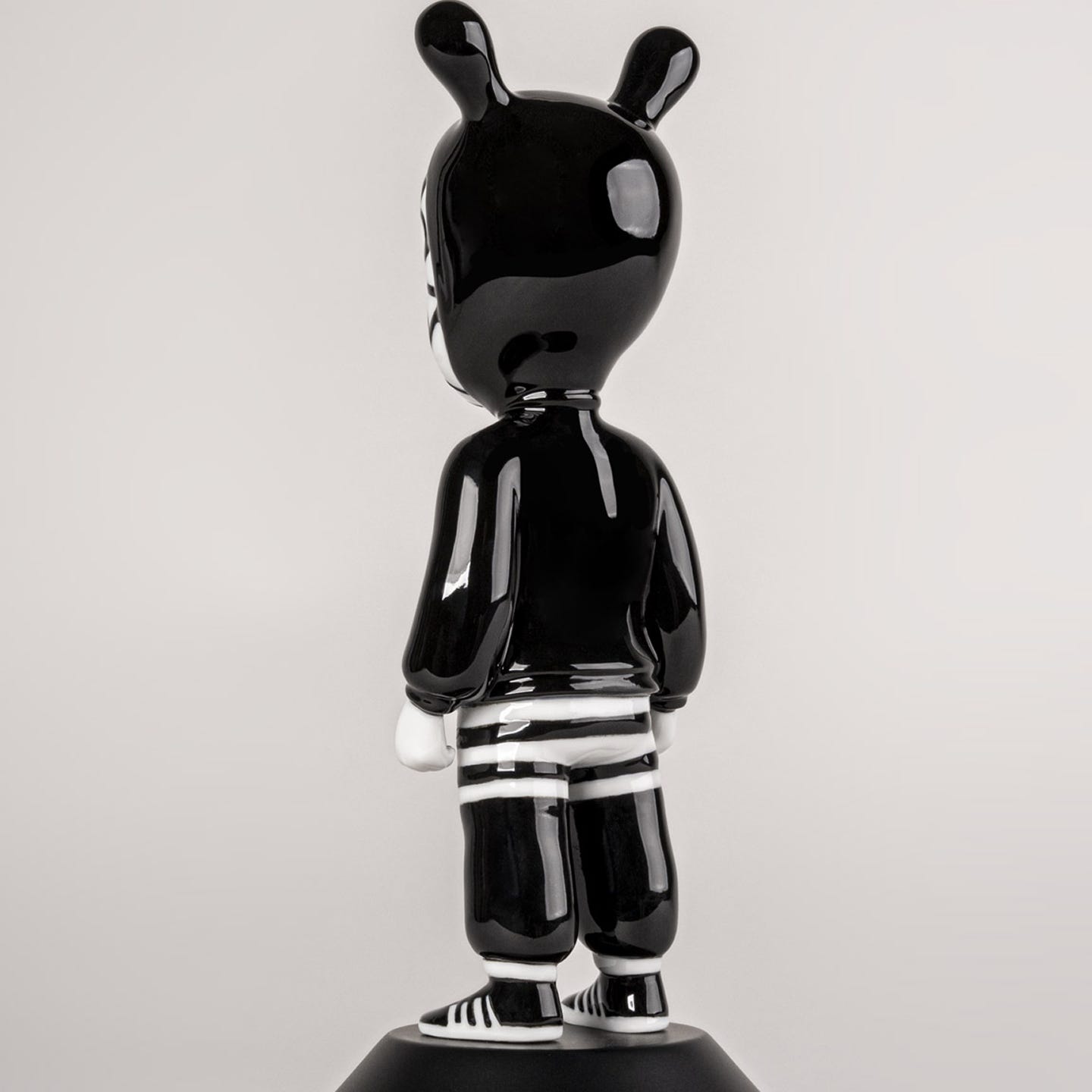
The two versions you created have different approaches but share your signature style. What did you want to emphasize in each one?
I wanted to create two distinct versions: one more complex, with patterns, and another simpler, so they would contrast with each other. My work sometimes leans toward complexity and density, while at other times it’s very direct and stripped down. That’s what I wanted to convey here, considering the two different sizes. And thinking about the cloak concept again, they could almost be two different “outfits” for The Guest, haha.
What has this collaboration with a brand like Lladró meant to you?
As I said, Lladró already held a lot of meaning for me, and I especially liked the romantic side of the project. In my work, collaborations with brands can happen for strategic or personal reasons, but this one was personal in a very special way. I would laugh so hard if in the year 2132 these creations were still present in people’s homes (though I doubt I’ll make it to that date, haha).
How would you like the public to engage with these creations?
I want people to approach my work without fear, almost without too much reverence. Like when you see a dog and you just feel like going up to pet it. You have to be careful, because you don’t know the dog, but the impulse is there because it’s fun. I think my work is similar. I want people to enjoy it, and if they feel like digging deeper into the meaning behind it, even better. Because then they’ll understand it in a more thoughtful way. But like with movies—if you didn’t fully grasp the director’s message but you still enjoyed the film and it makes you want to see more, I already consider that a success.
What effect do you want to provoke in those who look at them?
Beyond the aesthetic impact or the fetish element, which is usually the first thing people notice, I’d like it to make them think. What is this drawing trying to say? How was it technically made? With so many lines and so much work, where does this graphic language come from? What story does it tell? Where is The Guest going dressed this way? If it gets people to ask questions and exercise their thinking, then our work has been useful.